


Why we’re breaking away from an old philosophy.
“Mobile-first” once shaped the way modern websites were made. Well-intentioned designers and developers started from the smallest screen and scaled items up as more room became available. While it worked at the time, this approach is closed-minded by today’s standards. In this saturated and overly nuanced device size landscape, design and development teams would do well to implement an adaptive approach that is agnostic of singular device sizes.
If you think about it objectively, the “mobile-first” approach should work both ways. Whether you start with a condensed version of your website and then work your way up to desktop or the other way around, the focus isn’t your method. It’s your results. When you’re grounded in creative design and backed by development that accommodates flexible responsiveness, the need for the “mobile-first” approach dissipates. Our goal isn’t just to prioritize mobile—it’s to prioritize usability across every touchpoint.
Of course, you can’t cut mobile devices out of the picture entirely. Let’s talk about how mobile responsiveness is more than just another box to check and why our approach works.
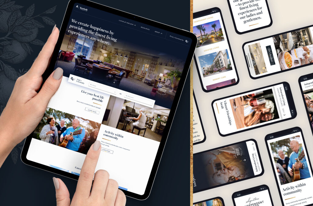
The Role of Mobile Responsiveness in Senior Living Site Performance
Your senior living website will be seen on a mobile device. There’s no avoiding it. Whether it’s an adult daughter researching communities while sitting in a parking lot or a retiree casually browsing on an iPad between lunch and book club, mobile is a default part of the journey. The problem occurs when your site feels awkward, slow, or hard to read. The moment the experience becomes uncomfortable, you’ve lost a lead.
Optimizing User Experience
Mobile responsiveness isn’t a trend or a checklist item anymore; it’s table stakes. Google knows it. Users expect it. And your leads demand it, whether they say it out loud or not.
However, when we talk about mobile responsiveness, we’re not just talking about scaling things down to fit a screen. We’re talking about whether the experience feels right—whether the text is legible without squinting, whether the navigation works without finger gymnastics, and whether a call-to-action is tappable without needing surgical precision. It’s not just about layout—it’s about function and flow.
Building Trust
A poorly optimized mobile site doesn’t just frustrate people, it quietly erodes confidence. If your website feels dated or clunky on mobile, visitors begin to question the quality of the care behind it. It’s the kind of friction that plants doubt and pushes them to the next option with a smoother experience.
Connecting with Real People
So yes, mobile responsiveness matters. It matters not because it’s trendy or expected, but because it reflects whether you’re paying attention to how people actually interact with your brand. It’s not about chasing screen sizes; it’s about meeting people in the moment, on the device they’re holding, with clarity and ease.
And in senior living, where decisions are heavy and emotions are high, ease matters more than ever.
The Risks of Ignoring Mobile Optimization
While it’s easy to put mobile to the side in the mindset of “accessibility over device size”, the reality is that not optimizing for mobile isn’t just a design issue. It’s a business liability. When your website doesn’t work well on a phone, people don’t sit around patiently trying to figure it out. They move on. That caregiver who was ready to schedule a tour? She’s now three clicks deep into another community’s site that loads faster, reads easier, and makes the process feel like less of a chore. She won’t be coming back.
Losing Your Audience
Here’s the thing: most of the people who visit your site don’t even realize they’re on mobile anymore. It’s just the way they access the internet. If your site breaks that illusion and reminds them that they’re on their phone because nothing fits, loads, or functions, you’ve already lost their attention and maybe even their trust.
Falling out of Search Engine Priority
It’s not just about user behavior. Google’s watching too. Search engines prioritize mobile usability now, so if your site is dragging, hiding important content behind broken layouts, or loading like it’s 2009, your rankings will suffer. That means fewer eyes on your community and fewer inquiries in your inbox.
Negatively Representing Your Brand
And let’s talk perception for a second. A senior living community website isn’t just a digital brochure; it’s a window into how you operate. If your site feels outdated or clumsy on mobile, what does that say about your services? Poor function loses faith in your care and your attention to detail, no matter how great they are in reality. People only know the story you tell them, so let’s tell your story the right way.
Practical Mobile-Specific Features That Improve Senior UX
Mobile Menus
Menus aren’t one-size-fits-all. In a device-agnostic design system, they need to respond flexibly to screen width, not just device type. The first breakpoint to consider is between 1920px and 1440px wide. This is where your menu layout starts to feel the squeeze. If your navigation includes six or more categories, a logo, a phone number, and a “Schedule a Tour” or “Contact” button, spacing between elements will tighten quickly as screen size decreases. Without smart adjustments, that crowding forces an early switch to a mobile-style menu.
We can prevent this by gradually adjusting the layout: scaling down the logo, tightening spacing, reducing font size, and resizing the CTA button. With careful planning, you can hold onto the desktop-style menu a bit longer, without compromising usability.
Around 1365px and below, it’s time to shift fully into your mobile menu. Even though this may still serve desktop-class devices like tablets, it should adopt a flexible, mobile-friendly structure. We use a consistent mobile menu across tablet and phone breakpoints. The layout goes something like this:
- Logo positioned clearly in the upper left
- A phone number and/or CTA button visible without scrolling
- The first menu item labeled “Home” (never assume people will intuitively tap the logo)
- Accordion-style submenus that expand with a simple tap for secondary pages
Designing this menu to work cleanly across iPad and mobile sizes removes the friction of having three different menu systems.
Button Hierarchy
Action clarity is non-negotiable. A three-tiered button system (primary, secondary, and tertiary) helps users understand what action matters most. Each tier should have light and dark variants to maintain contrast and visibility regardless of the section background.
How It Works:
- Primary: The main, high-intent, lead-generating CTAs. They might sound like “Contact Us” or “Schedule A Tour”. Their job is to indicate that the user is about to engage with your company, and should be designed as a solid fill color (one of the accent colors from your brand palette) that will grab the user’s attention.
- Secondary: Your “navigational” CTAs. They get people where they need to go throughout your website. Users need them to “Learn More” or go to the “Explore” or “About” page, and are usually designed as a button with a stoke, not a solid fill.
- Tertiary: Similar to your secondary buttons, these are also “navigational” in intent, but even more demoted. They are the catch all for any low level interactions you want people to take. For instance, the “Read More” button on a blog article snippet. The UI design of these are very basic, usually just the text accompanied by chevron style arrow.
On screens 768px wide or less, buttons should expand to full width within the content container. This provides easier tapping for older adults and gives visual weight to CTAs. Plus, we avoid ambiguous labels. Our buttons tell users exactly what they’re doing: “Call Now” initiates a phone call, not another page. A menu item labeled “Living Options” goes directly to that section, not a routing detour.
Viewport Height as a Design Guide
When designing for mobile, sizing isn’t just a matter of scaling elements down. You want to fit them into the right space intentionally.
We use viewport height (vh) as the design baseline. This allows each section (text, image, CTA) to be visually balanced without forcing unnecessary scrolling. Mobile widths typically range from 768px down to 350px, and we’ve found 365px to be a reliable mock-up reference point. With this fixed frame, we scale type, imagery, and buttons proportionally to maintain clarity and balance. It’s not about cramming everything into a small space. It’s about giving each element enough room to breathe within a well-defined frame.
Minimize Excessive Interactions
Desktop experiences often include hover effects, animations, or layered interactions that feel elegant in large spaces. On mobile, they tend to collapse under that complexity, which is why we disable many animations on mobile devices. If an interaction doesn’t serve a clear purpose or assist the user in completing a task, we remove it. For other elements like sliders or tabbed content, we enable auto-rotation or pre-expand items so users can see at a glance that there are multiple options without guessing or swiping blindly.
Prioritizing Mobile Content Without Wearing People Out
Keeping Readers’ Attention
Scroll exhaustion is a real problem on mobile, and it’s not talked about enough. It sneaks up fast, especially when a page stacks section after section with no clear rhythm or breaks.
People land on your site looking for answers, not a scroll marathon. And this is especially true for seniors and adult children who might already be overwhelmed by the decision in front of them. If the content feels too long, too dense, or too scattered, they’ll start skimming, then skipping, then leaving.
Purposeful, Strategic Placement
That’s why mobile content strategy isn’t only about stacking your homepage in the “right” order, but about designing breathing room. Sections should be short, direct, and purposeful. Think one clear message, one visual, and one action per scroll zone. UX experts point out that breaking pages into scannable segments improves both engagement and retention, particularly when paired with familiar visual anchors like section headers or image prompts (ux4sight.com).
And while it’s tempting to follow some universal formula for what should come first, second, or third, the truth is that your content hierarchy should reflect your strategic goals. If your top objective is scheduling tours, lead with action. If your brand leans more on trust and connection, maybe testimonials or a short intro about your community needs to come first. There’s no fixed order, only thoughtful prioritization.
Directing Interest with Clarity
Whatever sequence you choose, clarity is so much more important than density. Don’t overload the page. Don’t chase trends like infinite scrolling or parallax unless they genuinely help your users get where they’re trying to go. Long scrolling pages can feel intuitive, but for many seniors, they often lead to disorientation (interaction-design.org).
Navigation should always offer a way back. Sticky menus, “back to top” links, or anchor-based shortcuts can go a long way in helping people stay grounded. And remember: most seniors don’t want a dazzling experience. They want a usable one.
When the mobile flow respects those needs, it works. When it doesn’t, no amount of aesthetic polish will fix it.
“Approach & Intent” Over “Which comes first” Wins Every Time
Mobile-first had its moment. It gave us structure when screens were getting smaller and attention spans shorter. But the digital landscape and its users have evolved. What matters now isn’t which screen size you start with, but whether the experience feels right on every screen.
For senior living, that means thinking beyond the trend and designing around the person. It can be a 72-year-old browsing independently or a son researching communities on his lunch break. No matter who, the experience should meet them where they are without assumptions, confusion, and or extra effort
Responsive design gives you that flexibility. It’s not about shrinking desktop content to fit a phone. It’s about reshaping the experience so that the most important information, actions, and moments rise to the surface on every device. That’s not just better UX, it’s more respectful. It treats your users like they matter, regardless of how they access your site.
How Tilladelse Treats Senior Living Mobile Responsiveness
At Tilladelse, we don’t subscribe to “mobile-first” as a rule. We subscribe to usability-first. That means strategy drives structure. It means every layout decision gets filtered through real user behavior and business goals. And it means we prioritize clarity, trust, and access, not just screen width. We know that in senior living, the design is never just for a screen. It’s for a decision. And the way your site performs on mobile might just determine whether someone feels ready to take the next step or leaves with more questions than answers.